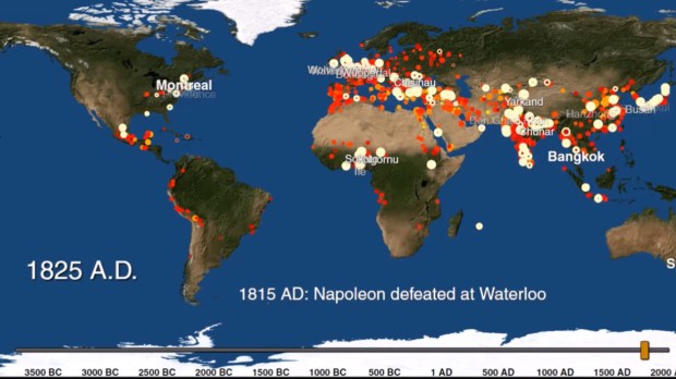
Tracking the location (and size) of the great cities around the world throughout the history of urbanization, this project, led by a group of researchers at Yale University, intends to help us understand “how cities have grown and changed over time,” in order to understand better how they are changing today, according to Yale’s Meredith Reba.
The post published by OpenCulture also states the data was originally published last year in Scientific Data, and it was an enthusiastic YouTuber (known on YouTube just as “Max,” a specialist in animated cartography) who came up with the animation that unfolds all this data in a brief five minutes of animated action.

